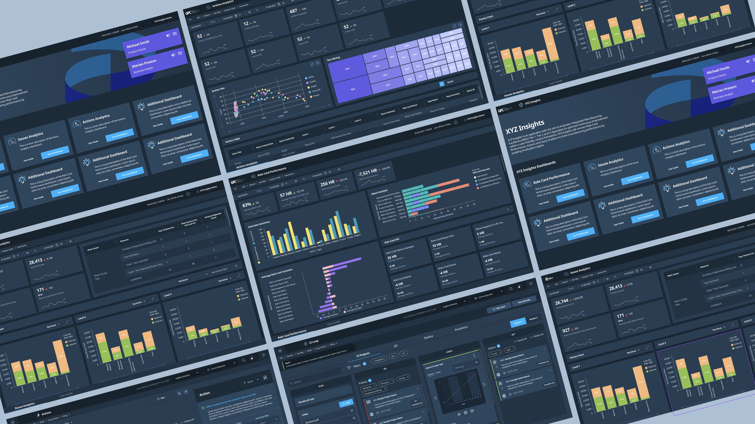
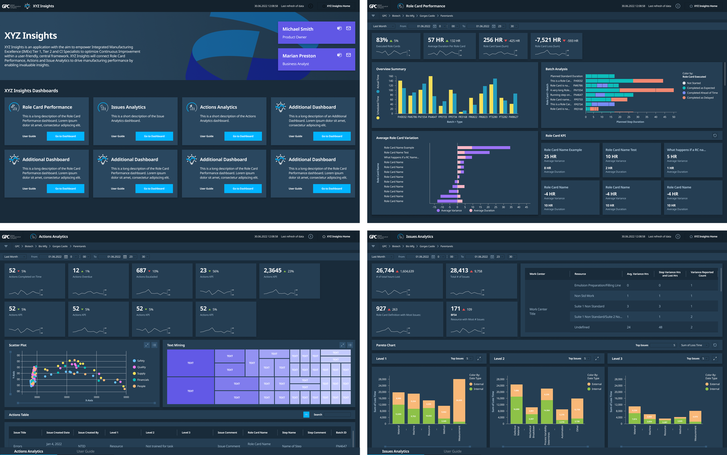
XYZ Insights
Prescriptive Analytics Dashboards
Roles
Lead UX Designer
UX Design, UI Design, Prototyping, UX Research
Duration
Jan 2022 - Sept 2022
Tools
Figma, Jira, Agile, TIBCO Spotfire
Team
UX/UI Designer, Product Owner, Business Analyst, Developers, UX Researchers
Overview
GPC, a worldwide pharmaceutical corporation*, has built an internal SaaS platform to enhance its production and manufacturing processes. To optimize their manufacturing, they want to analyze their production and manufacturing data from their SaaS platform, as well as their production output and employee efficiency. This MVP will provide valuable insights and recommendations to help the company take the next best actions for continuous improvement.
As the sole UX/UI designer on this project, it was my responsibility to understand the MVP requirements, establish open and thorough communication with the team, and translate the existing design system into a Spotfire-compatible system.
I worked alongside the Product Owner, Business Analyst, Front-End Developers, and UX Researchers to collaborate on our project. Using wireframing, visual design, and high fidelity prototypes, we brought our process to life by establishing our MVP release schedule, biweekly stakeholder feedback and revisions, incorporating the established design system, and MVP user testing.
The Challenge
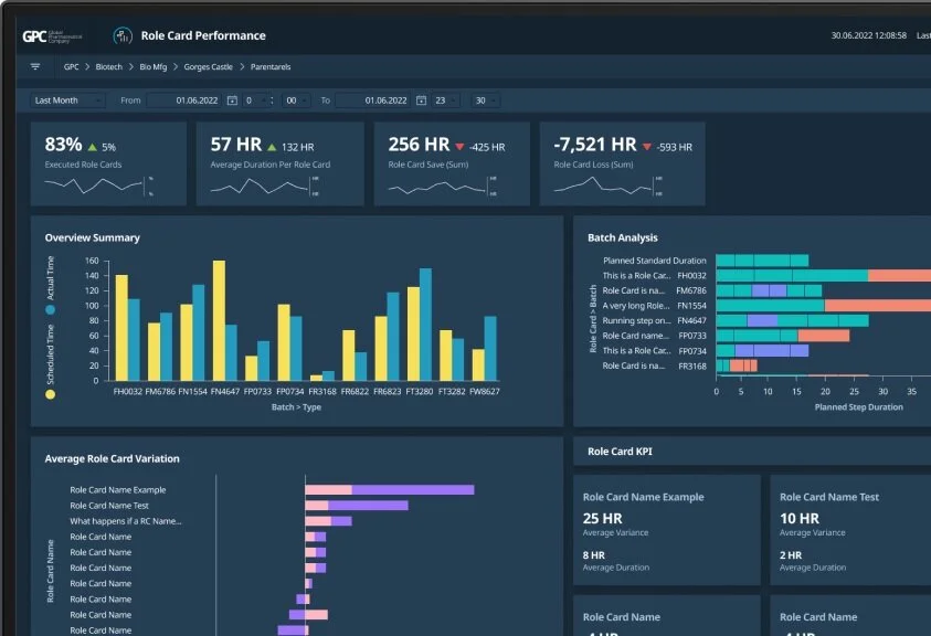
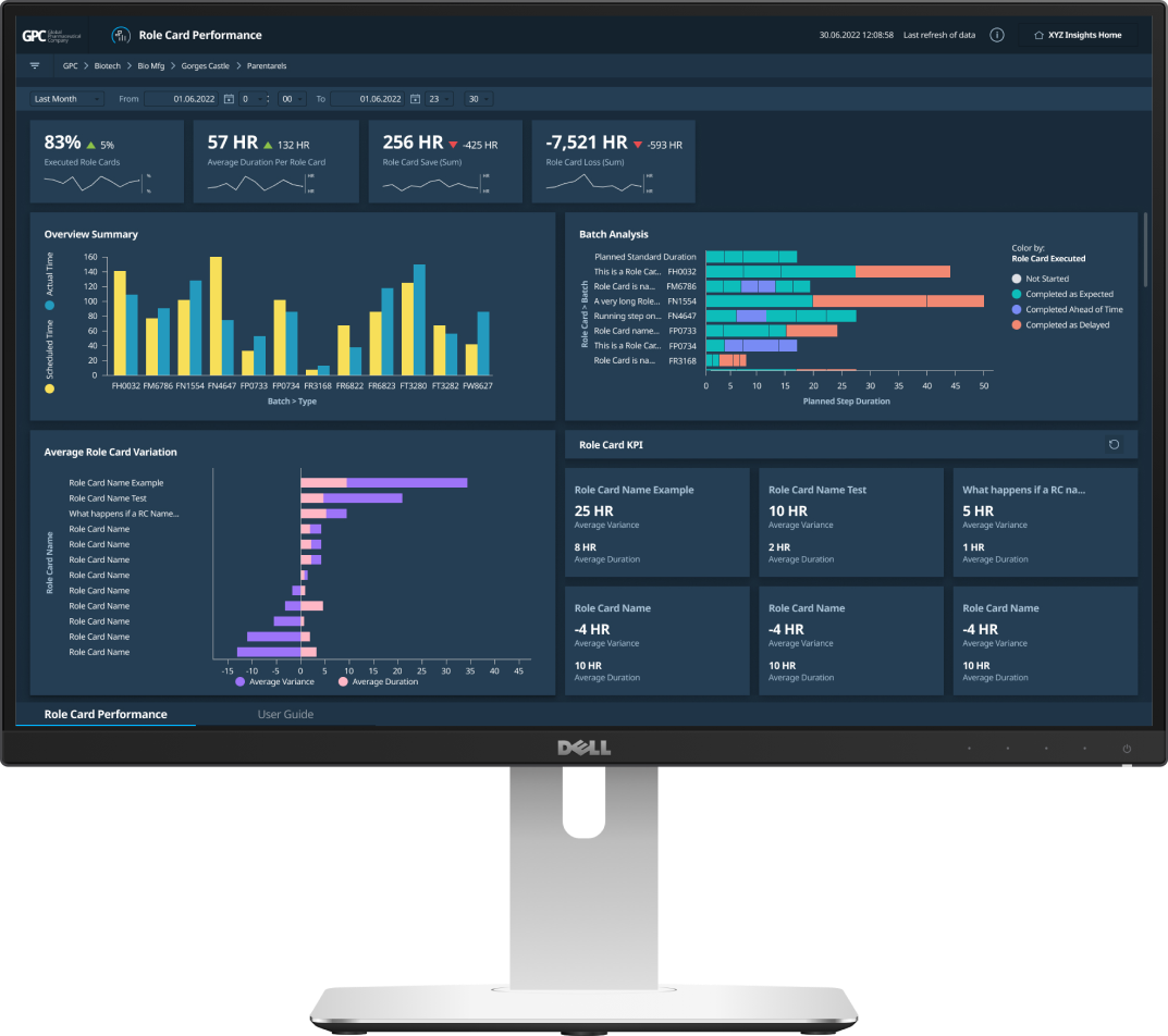
Global Pharmaceutical Company has built a robust platform for their employees to use and integrate into their work. The next step is to monitor progress and success to optimize output and implement three prescriptive analytics dashboards that analyze the production and manufacturing data that is consistent and familiar to the user.
Context
Process
The team aimed to create organized and visually consistent dashboards that highlight collected data from digital applications and reflect stakeholder needs for reliability and efficiency:
Representation through data visualization
A layout that visually emphasizes crucial KPIs and data
Use GPC’s design system to ensure visual consistency
Adapting to limitations and constraints with TIBCO Spotfire platform
Homepage for dashboards and easy user access
I collected data and visuals from various stakeholders' custom-built dashboards that help with their daily workload. These dashboards provided insights on how to prioritize what is displayed in the analytical dashboards. The client gathered feedback from stakeholders during biweekly discovery meetings and highlighted current pain points associated with the updated designs. This helped us stay on schedule for the limited time we had for the MVP release.
Since I was building the dashboards in TIBCO Spotfire, communication was crucial among the design, product, and development teams. We needed to test our design constraints, build and update a Spotfire component library, and create new elements within the dashboard environment. Additionally, we needed to ensure that data visuals and filters were functioning properly.
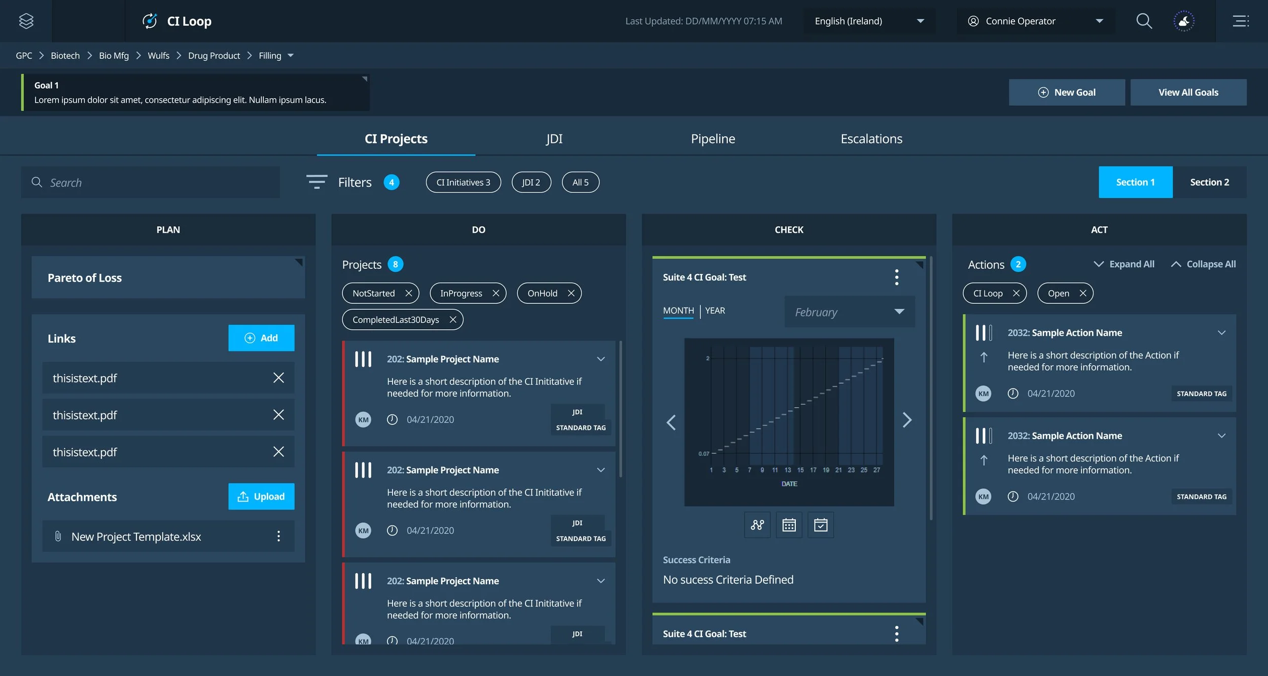
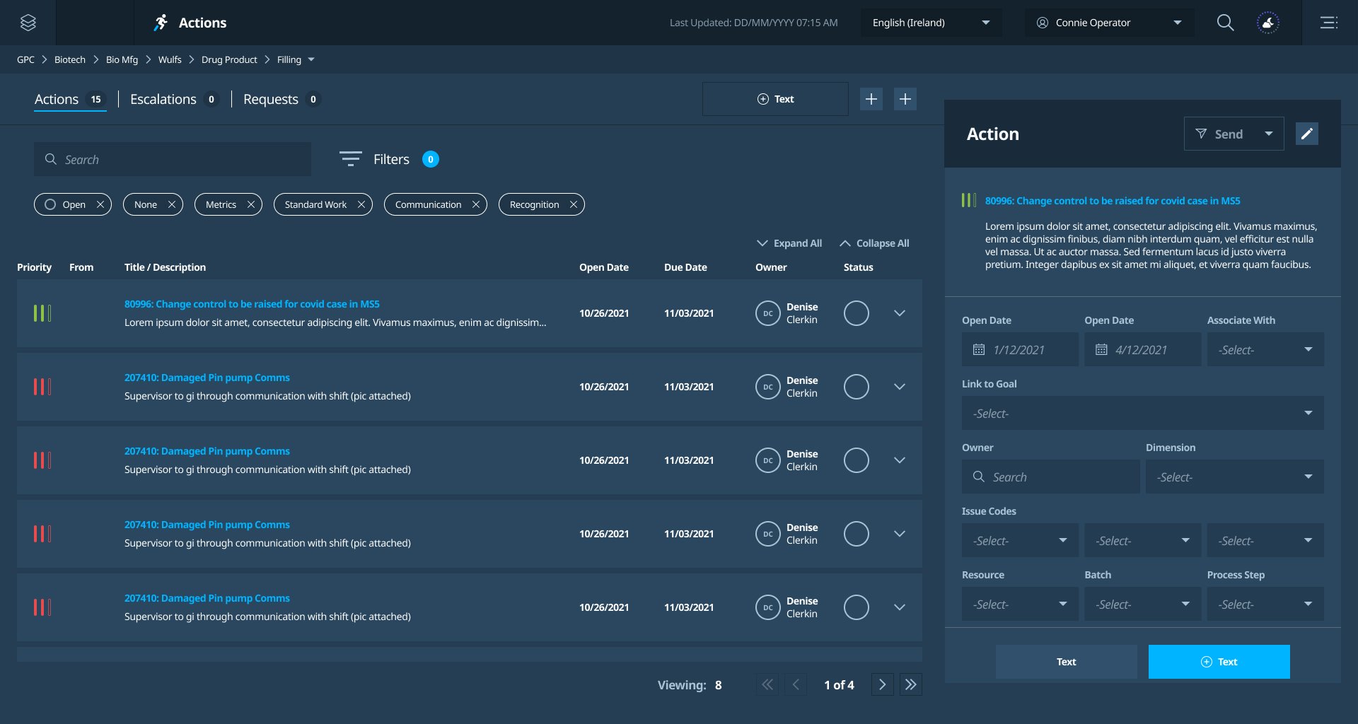
GPC existing digital application that monitor projects and actions.
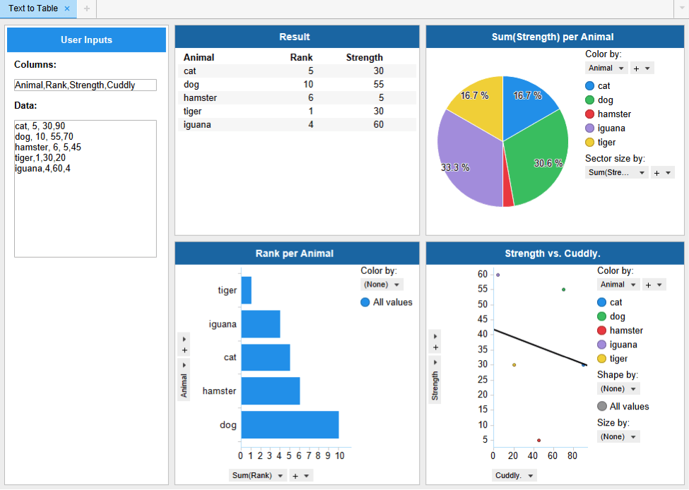
Example of TIBCO Spotfire dashboards; representing employee’s custom-built dashboards.
Solution
It was vital to establish a clear hierarchy in the layout so that stakeholders could fully utilize the product. The dashboards are designed to assist in determining the best course of action, so it was crucial to emphasize areas that need improvement.
The Global Pharmaceutical Company's well-established design system enabled me to rapidly create the dashboard's visual design. By combining Spotfire components and implementing a new compatible design system for the dashboard platform, we maintained brand identity and consistent usability across all digital applications within GPC’s SaaS. It was important to maintain open communication with the developers responsible for building the components to ensure consistency between the designs and usability.
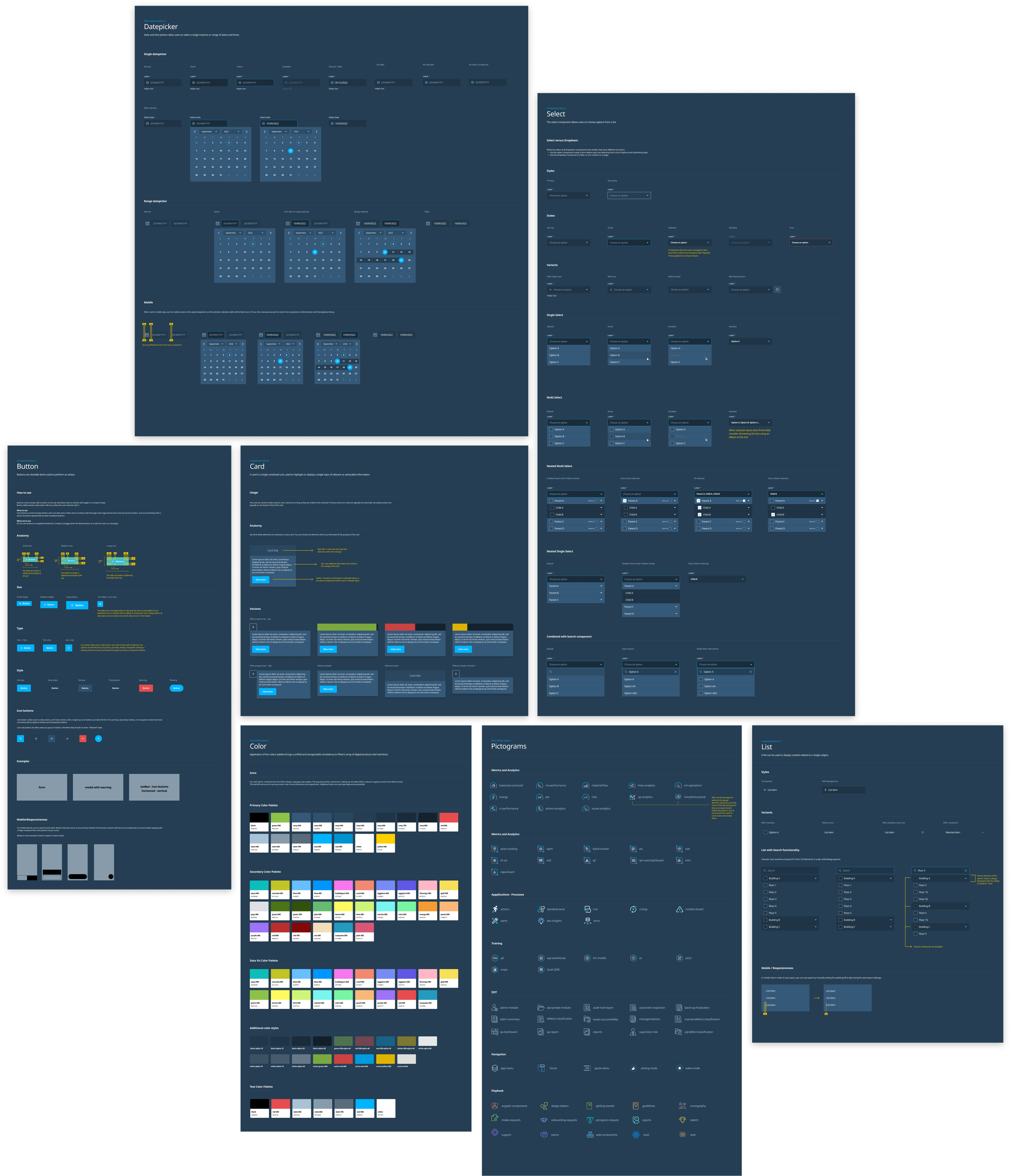
Design System
Using the GPC design system, I could create dashboards and simplify the modification of Spotfire components swiftly.
Significant design system changes for Spotfire compatibility were:
Functional components within the dashboard, such as the side filter, dropdown menus, checkboxes, accordion menu, and customized search and form fields
Template customizability, such as icons, section layout, and data visualization
A consistent visual theme that distinguishes the client in a user-friendly way
Testing
When I finalized the MVP concepts, I collaborated with UX researchers to conduct usability testing with workers at the manufacturing sites who will be using the dashboards to analyze their work. During this process, we asked stakeholders to go through the prototype and share their thoughts out loud. We collected feedback on the layout format, visual design, content organization, and more. Important components that were revised from user feedback are:
add a more in-depth time and date dropdown to the date filter, which users found helpful for their searches.
Users identified a preferred visual hierarchy for the data visualization components they wanted to see first.